Brand & design
Resources
Brand & design
One visual system: deep navy, sage and mint, with pill shapes and a blueprint grid. Everything Prongo puts on screen is built from the palette, type, and shapes on this page.
The look
Prongo is a dark theme. A deep navy page, sage for everything you can act on, and mint for the loudest words. Surfaces are pills and softly rounded cards, the navigation floats, and a faint blueprint grid sits behind the hero. It should feel like a precise tool: calm, sharp, a little technical.
Colour
Four brand colours, plus one derived surface tone. These are the ones to know:
Background #11151c
Deep navy. The page behind everything.
Surface #171c25
Raised navy. Cards and panels sitting on the page.
Sage #b7d894
The signature colour: buttons, links, active states and the second headline line.
Mint #e0f8c7
Headlines and the brightest highlights.
Muted #9ea6b8
Body text and secondary copy. Grey-blue, never pure grey.
Borders and hover fills are tints of the navy, and status colours (success, warning, error) are softened to sit on it. Sage on navy and mint on navy both pass AA for text.
Typography
Space Grotesk
The display face. Headings and short emphatic labels. Set a little tight, so large lines hold together.
Special Gothic
The text face. Everything that isn't a heading: body copy, buttons, and interface labels.
Both are open-source fonts available on Google Fonts. Code and configuration are shown in a plain monospace face.
Display
Host your monorepo as one
Heading
What happens when you push
Subheading
Secrets & environment variables
Lead
The short version of everything, in one place.
Body
You describe the services in your repo with one small config file, push with git, and the platform builds, wires, and deploys them together.
Caption
Changes take effect on the next deploy.
Logo & wordmark
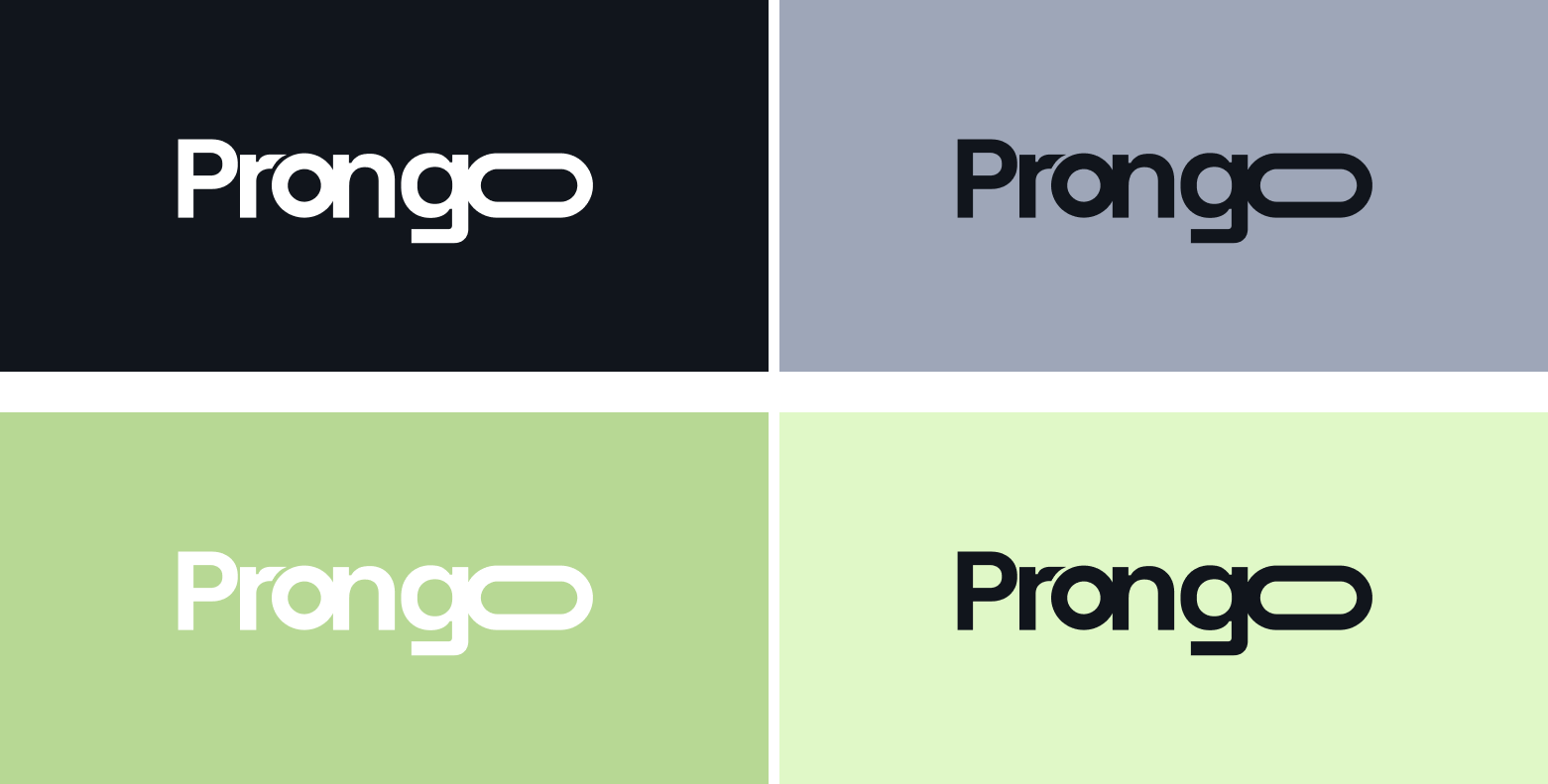
The logo is the word Prongo in a heavy geometric sans, with the final o stretched into a wide pill. The pill is the signature: it stands for one long container carrying a whole monorepo. Where space is tight, the P on its own is the icon.
White on navy
Default on the site and in the product.
Navy on grey-blue
Muted panels and print.
Navy on sage
Accent panels and social covers.
Navy on mint
Light backgrounds.
- ✓ Keep clear space around the logo equal to the height of the P.
- ✓ Use white on navy; use navy on grey-blue, sage and mint. Never put white on sage: it is only about 1.6:1 contrast, where navy on sage is over 11:1.
- ✓ Do not recolour outside the four pairings above, and do not stretch, rotate, outline, or add a shadow.
- ✓ Write the name as “Prongo”: one word, capital P, the rest lowercase.
Downloads
- prongo-logo-light.svg · Wordmark in white, for dark backgrounds
- prongo-logo-dark.svg · Wordmark in navy, for sage, mint and light backgrounds
- favicon.svg · The P icon: sage on navy
- logo_bg_match.png · Overview of the four logo and background pairings



Shape & depth
Radii
sm
0.5rem
md
0.75rem
lg
1rem
xl
1.5rem
2xl
2rem
full
9999px
Shadows
sm
Resting cards and buttons
md
Cards on hover
lg
Floating panels and dialogs
All three are pure black at low opacity, deeper than on a light theme so they still read on navy. Surfaces use the smallest by default and lift to the next step on hover.
Motion
- ✓ Motion follows your system's “reduce motion” setting. Turn it on and the animations don't play.
- ✓ Content fades and rises gently into view as you scroll, once per element.
- ✓ Everything eases on the same soft curve: quick enough to feel responsive, slow enough to follow.
- ✓ Nothing loops or competes for attention. The one exception is a single badge on the home page that drifts a few pixels.